Logotype
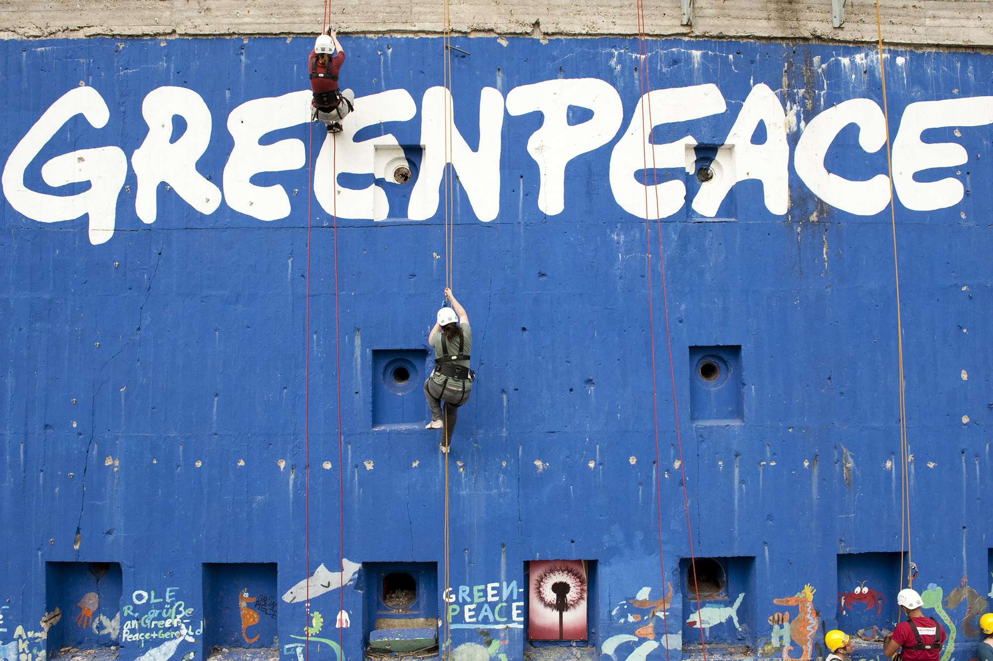
The history of the graffiti logo
When Greenpeace International was set up in the late 1970s there was one item that kept appearing on the agenda of every annual planning meeting: finding a common logo.
In those days, there was no agreed way to write (or even capitalise) "Greenpeace." Some adopted a First Nations crest while others used a peace sign and the ecology icon with "Green Peace" as two words. Some wrote "Greenpeace" in the Times New Roman font, and others would use whatever typeface they fancied that week - often depending on which Letraset sheets were lying around the office or ship.
Whenever the logo came up for discussion, it would either lead to an argument based on personal preferences or get overlooked in favour of more important campaign matters.
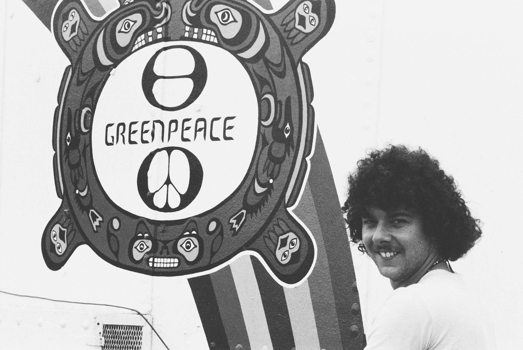
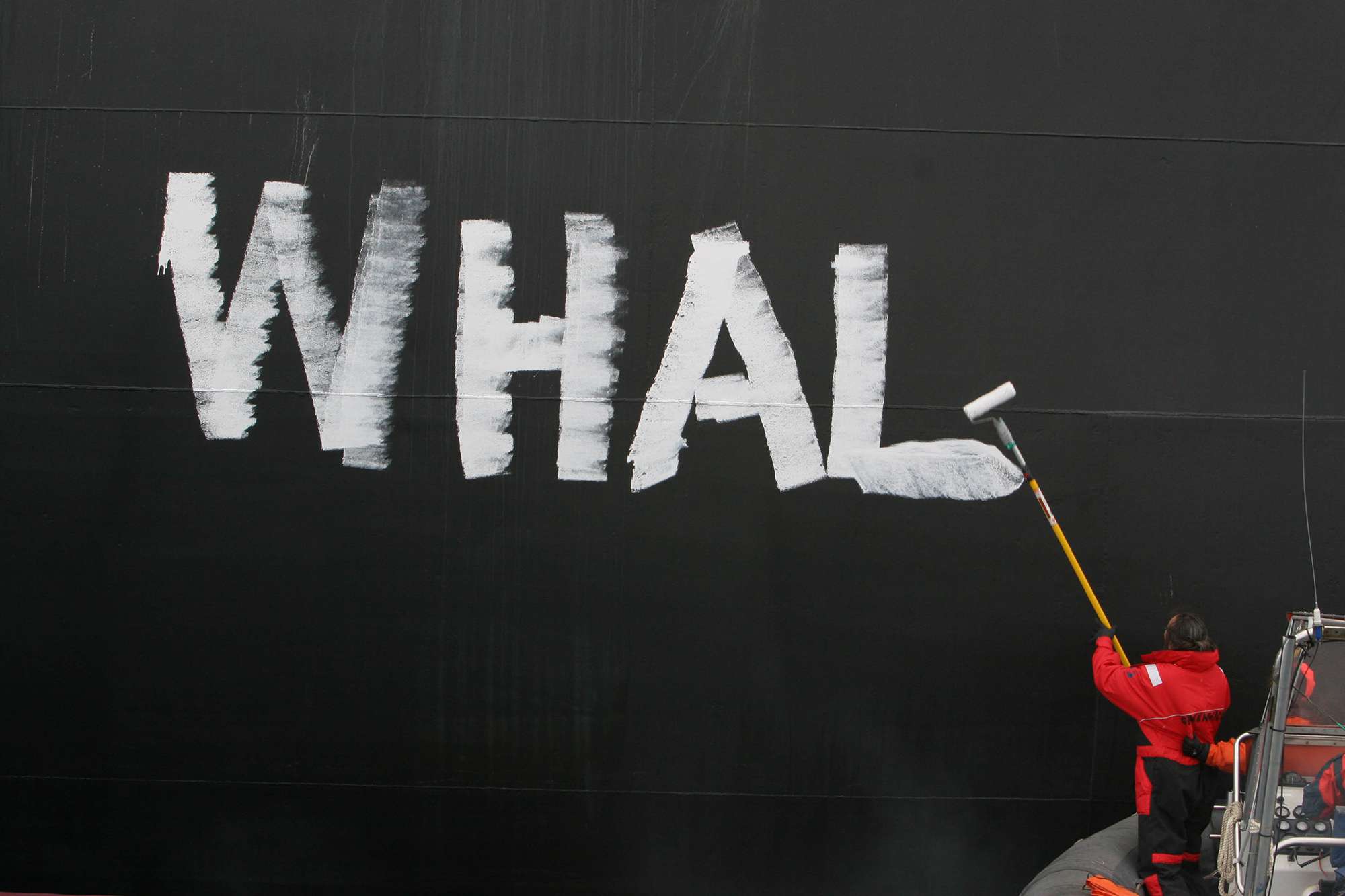
Rémi Parmentier, one of the founders of Greenpeace International, recalls “One day in Paris in the early 80s, we were out of Letraset sheets and the local stationery shop was closed. A publication needed a Greenpeace logo. So a fellow named Jean-Marc Pias, who had been making posters and stickers, ran around the corner to a bar and asked an artist friend named Patrick Garaude to write out "Greenpeace" for him.” Garaude drew quickly with a fat felt-tip pen, on a beer mat, and the "graffiti logo" was born.
It was adopted by office after office and ship after ship until it became one of the most recognised symbols in the world. Rémi says: "Whenever I see that logo today, especially in remote places like Antarctica and the Amazon, I remember Garaude with a pen in one hand, and a beer in the other."
The logotype today
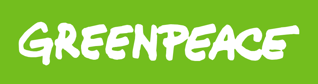
Patrick Garaude’s logo, which is technically a logotype, has since been digitised for modern print and digital use, but retains its ‘felt-tip pen’-quality and imperfect contour. This hand-painted look is a key identifier of Greenpeace’s brand legacy and anchors our visual identity in the organisations grass root beginnings.
The logotype is an important asset of the organisation, and is often the only consistant visual element across our wide and continuously changing portfolio of global and local campaigns. As such, it is important to use it correctly.
The logotype should only be reproduced from master artwork, available for download below, and should not be redrawn or altered in any way. As a globally established symbol, the logotype is recognisable by its shape, not how it reads. Using different versions could lead to confusion in languages that use non-Roman characters.
The below figure shows the rules of proportions and placement that should be observed when using the primary logotype on any media.
Primary logo
The basic Greenpeace logo in green with its underlying grid showing proportions and exclusion zone.
The minimum acceptable width is 30 mm or 90 pixels, and only where space is limited.
The exclusion zone (marked with a red dotted line) is much like the safety zones established around offshore oil rigs, that we occasionally challenge when conducting non-violent protests against the fossil fuel industry. It exist to protect the logotypes integrity and ensure that it is never visually dominated by other graphic elements.
Note that the contour is aligned to the bottom of its 30 x 5 boundary. This is to optically account for the descender on the ‘g’ - simply vertically centering the logotype would cause it to appear closer to the top of its boundary. It is especially important to remember this adjustment when using the logotype in a fixed size container, such as the negative logotype shown below.
Negative logo
The negative Greenpeace logo, white on a green background, with its underlying grid showing proportions and exclusion zone.
Color palette
Not quite all the colors of the rainbow
While we do not limit the use of color in our issue-specific campaing material to a defined palette, our core visual identity is centered around one perticular shade of green.
’Greenpeace Green’ is a vibrant, modern and distinctive color. It is used for our primary logotype, as well as for the background of the negative version.
We use a secondary, darker green as a contrast. Examples of application include type set on a background of Greenpeace Green or as a background for type set in Greenpeace Green, as seen in the palette below. It should never be used for the primary logotype, or as a background for the negative version.
Both Greenpeace Green and the secondary green is used extensively for user interfaces on our digital platforms and in print layouts.
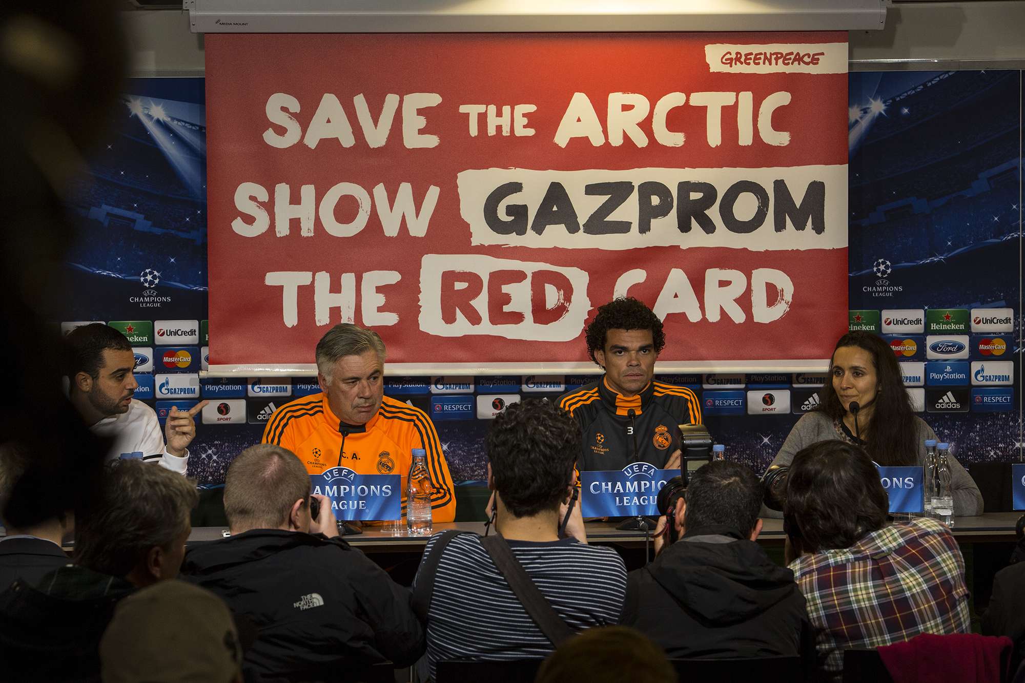
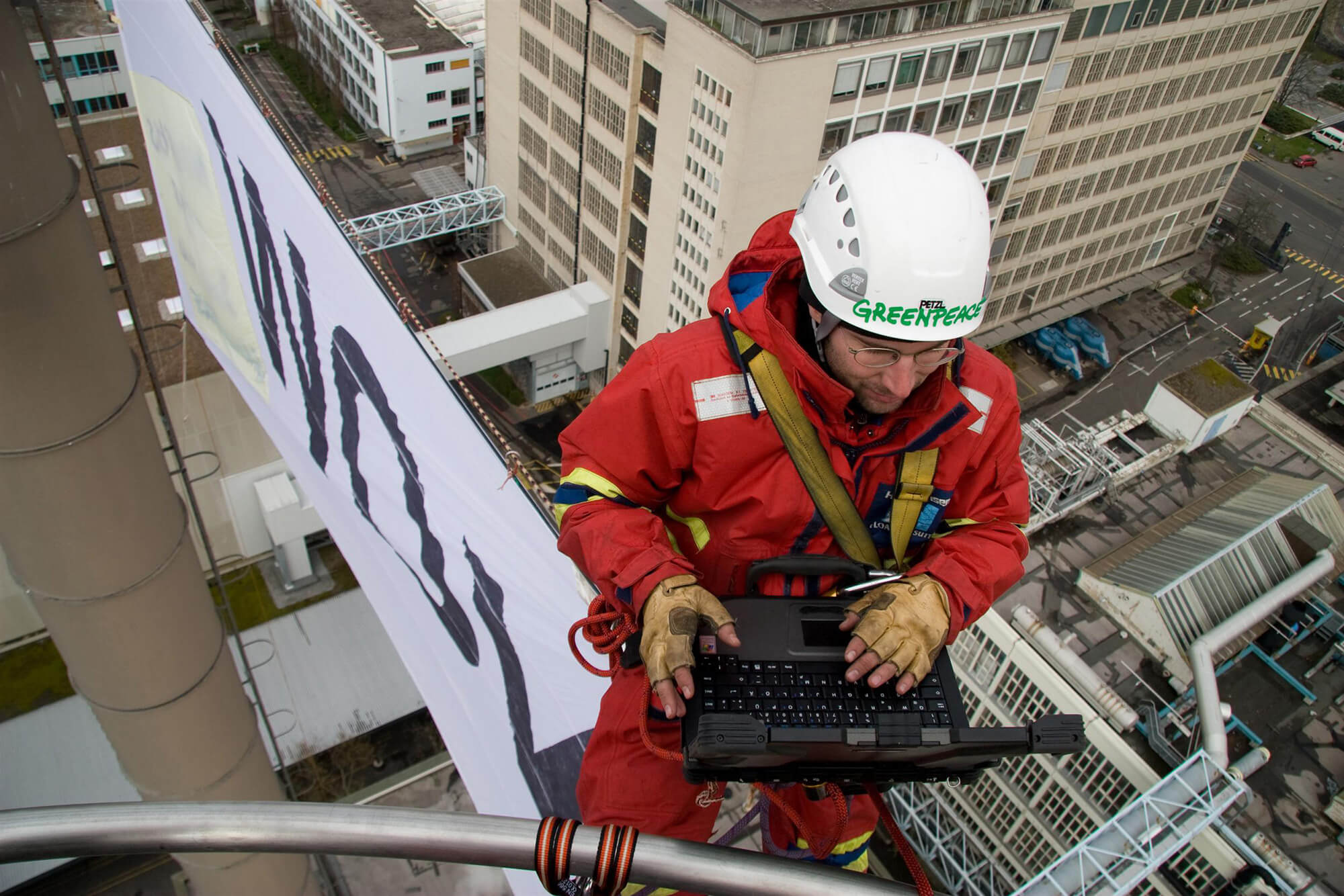
Greenpeace Nordic uses a tertiary accent color – ’Banner Yellow’. While this is the first time we define the shade, yellow is not new to the Greenpeace palette. Our audience already associate us with the iconic yellow campaign banners we have been utilizing in non-violent direct actions for more than 40 years.
Banner Yellow should only be used for items that need special highlighting. Examples include ‘call to action’-buttons in user interfaces, display type on print and digital ads, and of course banners and clothing for activities.
In addition to the three colors, we use a range of greys for type, UIs and layouts. These are not limited to set values, but as a rule of thumb you should avoid using more than three greys on any communication product.
Greenpeace Green
- Pantone 376 C & U
- CMYK 55, 0, 100, 0
- RGB 115, 190, 30
- HEX #73BE1E
- Tint 80% RGB 143, 203, 75 HEX #8FCB4B
- Tint 60% RGB 171, 216, 120 HEX #ABD878
- Tint 40% RGB 199, 229, 165 HEX #C7E5A5
- Tint 20% RGB 227, 242, 210 HEX #E3F2D2
Secondary Green
- Pantone 349 C & U
- CMYK 100, 0, 75, 57
- RGB 0, 92, 66
- HEX #005C42
- Tint 80% RGB 51, 125, 104 HEX #337D68
- Tint 60% RGB 102, 157, 142 HEX #669D8E
- Tint 40% RGB 153, 190, 179 HEX #99BEB3
- Tint 20% RGB 204, 222, 217 HEX #CCDED9
Banner Yellow
- Pantone 109 C & U
- CMYK 0, 15, 100, 0
- RGB 255, 210, 0
- HEX #FFD200
- Tint 80% RGB 255, 219, 51 HEX #FFDB33
- Tint 60% RGB 255, 228, 102 HEX #FFE466
- Tint 40% RGB 255, 237, 153 HEX #FFED99
- Tint 20% RGB 255, 246, 204 HEX #FFF6CC
Typography
Helvetica Neue LT Pro
'Helvetica Neue' is the font family for our core communications. It has been chosen for its simplicity, readability and availability. Helvetica Neue is a large family, and we strive to limit the weights used to: Light, Medium, Bold, Bold Condensed and Black. Light should be used as the primary weight for body texts, with medium for emphasis and bold for headlines. Black may also be used for headlines when an expanded hierachy is needed, but should otherwise be reserved for dislay text on ads and banners
Design professionals should manually kern display type. Other communications staff can set kerning to -10. For web applications (including this style guide) we use the optized eText versions of Light, Medium and Bold.
Licenses for .ttf, .woff and .eot formats are available for communications staff and freelancers through christian.uhlenfeldt@greenpeace.org.
Light
Use for body text.The quick brown fox jumps over the lazy dog. 1234567890.
The quick brown fox jumps over the lazy dog. 1234567890. Lorem ipsum dolor sit amet, consectetur adipiscing elit, sed do eiusmod tempor incididunt ut labore et dolore magna aliqua. The quick brown fox jumps over the lazy dog. 1234567890.
Read more…Medium
Use for body text emphasis.The quick brown fox jumps over the lazy dog. 1234567890.
The quick brown fox jumps over the lazy dog. 1234567890. Lorem ipsum dolor sit amet, consectetur adipiscing elit, sed do eiusmod tempor incididunt ut labore et dolore magna aliqua. The quick brown fox jumps over the lazy dog. 1234567890.
Read more…Bold
Use for headlines and buttons.The quick brown fox jumps over the lazy dog. 1234567890.
The quick brown fox jumps over the lazy dog. 1234567890. Lorem ipsum dolor sit amet, consectetur adipiscing elit, sed do eiusmod tempor incididunt ut labore et dolore magna aliqua. The quick brown fox jumps over the lazy dog. 1234567890.
Read more…Bold Condensed
Use for display and action banners.The quick brown fox jumps over the lazy dog.
The quick brown fox jumps over the lazy dog.
#1234567890
Black
Use for display and action banners.Save the quick brown fox –
Jump over the lazy dog!
Green Plakaat
'Green Plakkaat' is a custom version of David Kerkhoff's typeface 'Plakkaat' for exclusive use by Greenpeace. Mr. Kerkhoff kindly redrew parts of the original font to fit our needs, including additonals glyphs and tweaked kerning. Mr. Kerkhoff, who is a long time supporter of Greenpeace in the Netherlands, kindly donated 'Green Plakkaat' to be used freely by all Greenpeace offices, both for print and as a webfont.
Green Plakkaat is a vertisile brush font that compliments and contrast our primary font family 'Helvetica Neue LT Pro'. The tradition of hand painted banners and protest signs (and the occasional hull of a pirate fishing vessel), runs deep in our history, as is evident in our logotype. With Green Plakkaat we want to revitalize the activst roots in our visual communication, where a little extra punch is needed. Use it for short statements, on it's own or in combination with Helvetica, in your social media ad, on your action banner or for that obligatory Gandhi quote in your street flyer. Use it responsibly and in moderation though - it's meant to be a supplement and is entirely unsuitable for longer paragraphs, small type and formal communication.
'Green Plakkaat' is available in .ttf, .woff and .eot formats. To obtain a copy contact christian.uhlenfeldt@greenpeace.org. If you are not a Greenpeace employee, you can purchase the original 'Plakkaat' font here.
Social Media
Profile assets
Most mayor social platforms allows users some level of visual customisation. The most basic – and by far most important – is the 'profile image'. It acts as the account owners avatar, appearing next to every posts in the followers feed, on Facebook, Twitter, Instagram and many other services.
Using the Greenpeace logotype, which is rectangular, in a square profile image is impractical. The minimum sizes dictated above cannot be adhered to, and as a result it can be difficult to recognise. Go get around this, we're breaking the rule that the logotype should never be modified, and using the 'G' alone as an 'app icon'-style image. The highly recognisable 'grafitti'-look of the 'G' combined with the 'Greenpeace Green' color lets audiences identify the profile image as belonging to Greenpeace. This profile image maybe be used for any social media platfrom, and can also be used as an app icon or a 'favicon' for websites bookmaking.
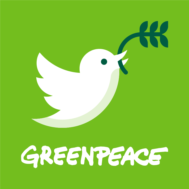
For Twitter, we have made a fun little mashup of Twitter's bird logo and the peace dove carried on the side of all Greenpeace ships. This is entirely optional.
Profile images
The primary social media profile image and the alternative version for Twitter.
